
DataGPT Dashboard User Guide
What is a dashboard for?
A dashboard gives you a centralized view of key business metrics. Use it to monitor day-to-day operations, campaigns, or user-operations initiatives; compare results over time; and break metrics down by dimensions such as channel, product, and audience. This helps you assess performance and make better operational decisions.
Creating a dashboard
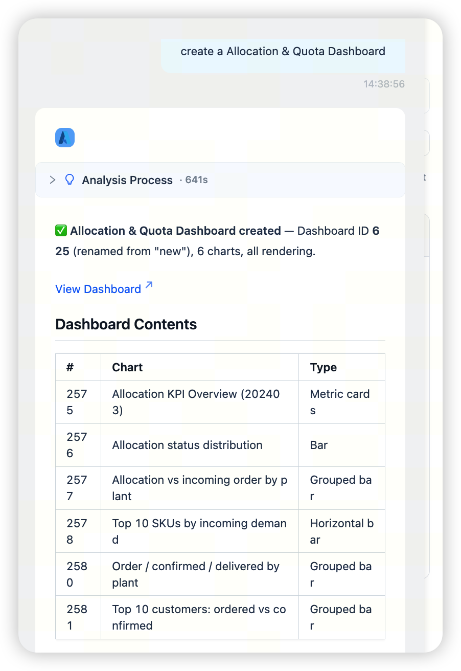
Ask a question on the analysis page, then choose to create a new dashboard or save the result to an existing dashboard. Once the system generates a chart or table and the save is complete, you can open it from the quick link below the conversation or find it under Dashboards in the left navigation. The dashboard list shows the number of charts, the associated domain, and the last updated time.
Editing and adjusting a dashboard
Dashboards support two editing methods: ASK AI and manual editing.
When to use ASK AI and when to use manual editing
If you need to add a chart or modify data content and analysis logic, use ASK AI first. If you mainly need to adjust styles, layout, or the display details of an individual component, use manual editing first.
Use ASK AI when you need to:
- Add a chart.
- Modify query logic, metric definitions, or filter conditions.
- Choose an appropriate chart type to express the data.
- Adjust the content of multiple charts at the same time.
Use manual editing when you need to:
- Apply consistent colors, fonts, corner radius, and spacing across the dashboard.
- Adjust the title, labels, border, or background of an individual component.
- Switch the display format of similar charts.
- Preview changes and fine-tune them iteratively.
- Make a change that is easier to identify visually than to describe precisely.
Editing with ASK AI
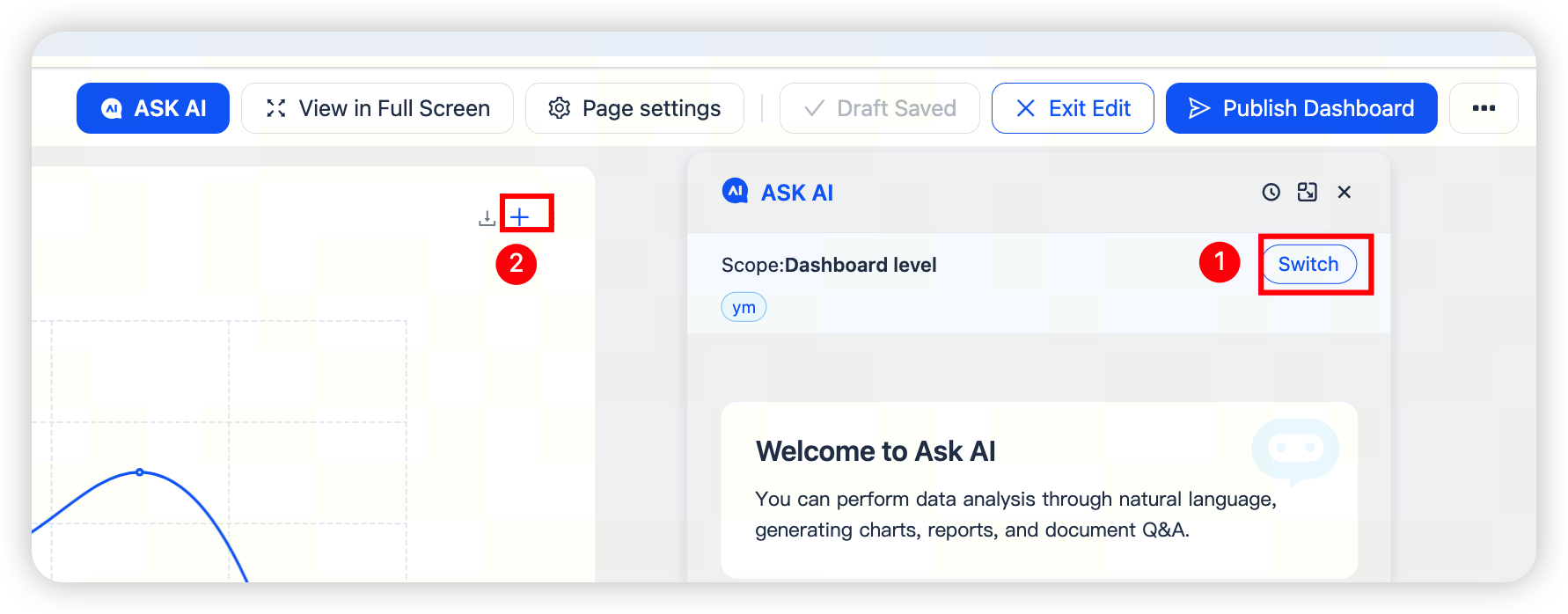
Select Edit dashboard → ASK AI to enter editing mode, then describe the changes you want in the dialog.
ASK AI applies to the entire dashboard by default. To edit only selected charts, switch to chart-level editing and click the + icon in the upper-right corner of each target chart to add it to the editing scope.
Creating a filter
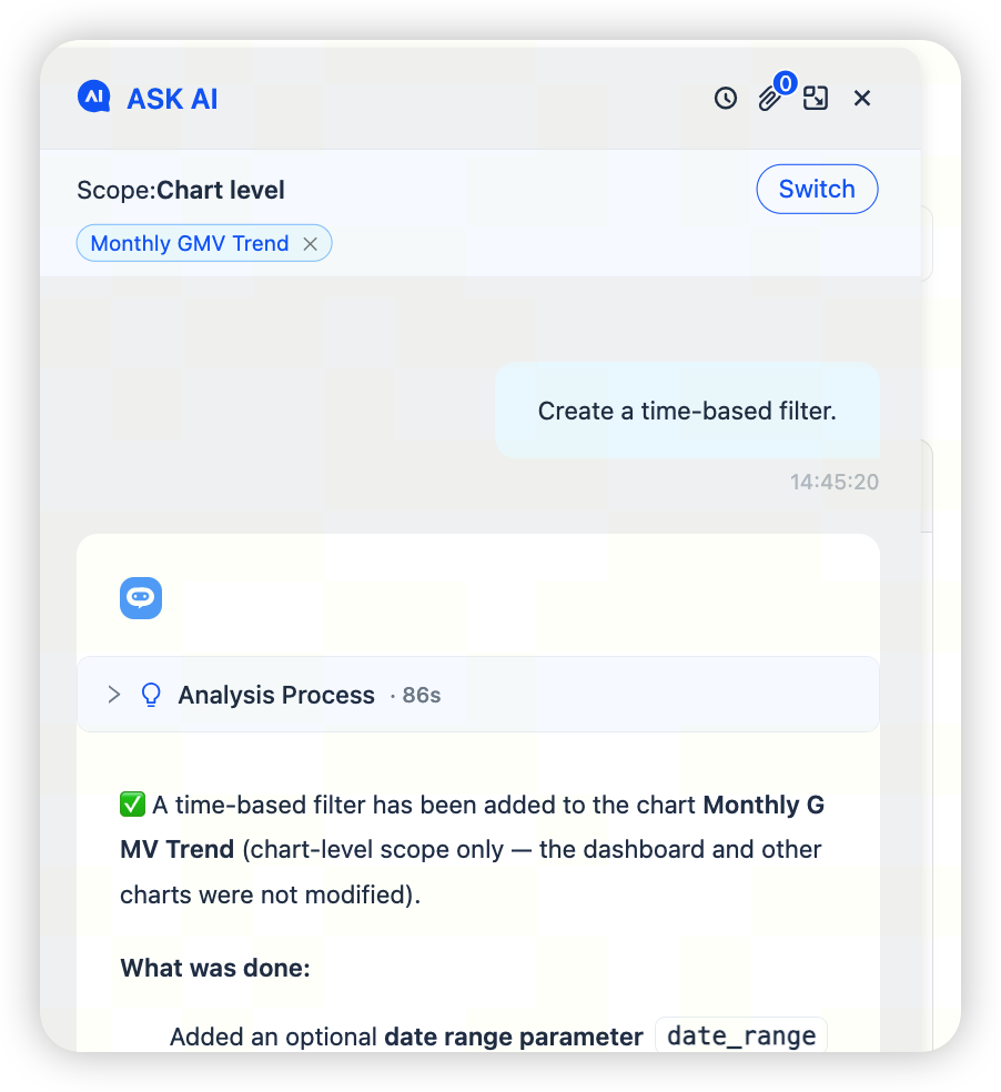
If you need to filter a metric in a chart, first switch to chart-level editing, then use ASK AI to describe the metric and filter conditions you want to apply.
Manual editing
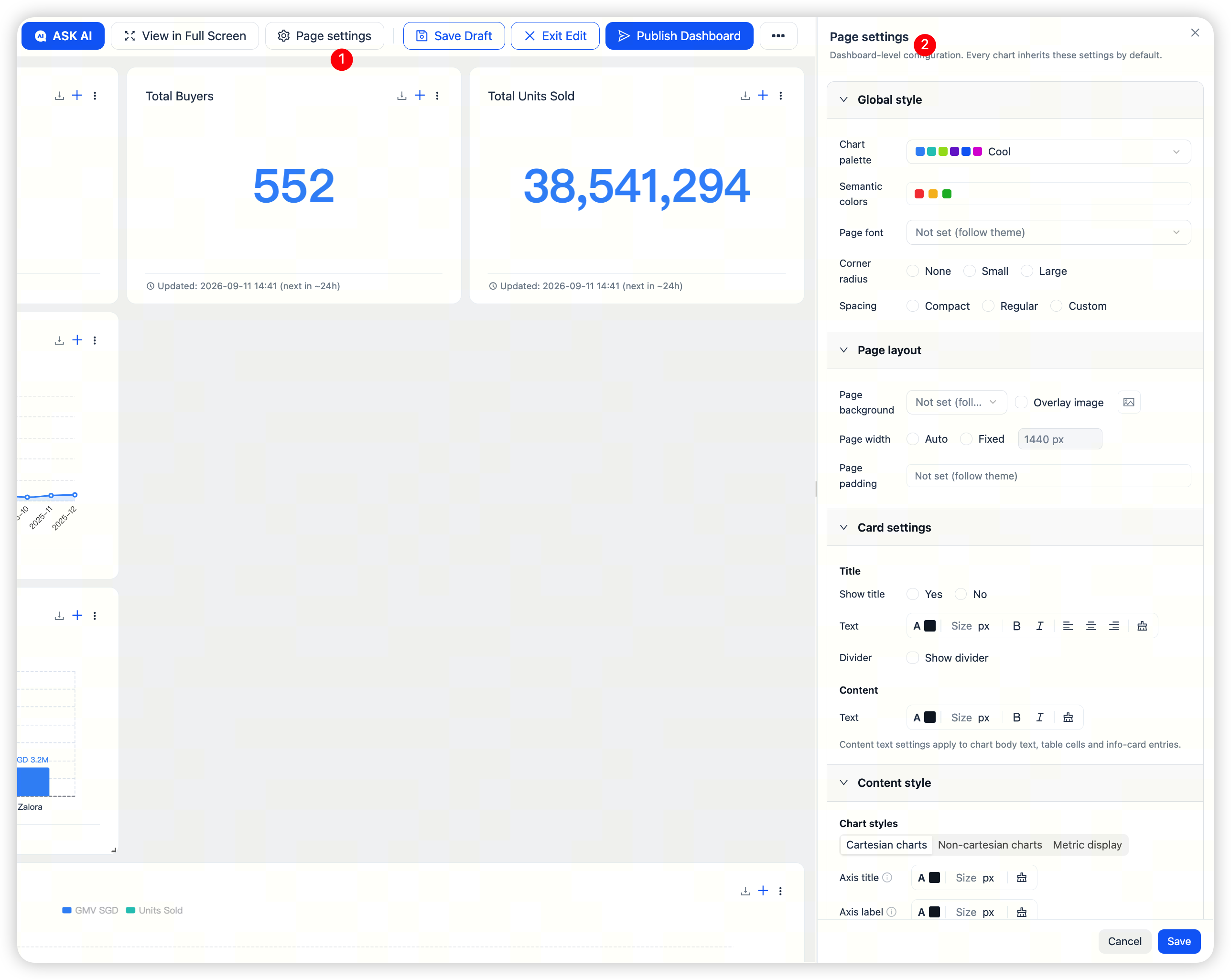
Select Edit dashboard to enter editing mode. You can then adjust the dashboard through the following two entry points:
- Page settings: Apply settings to the entire dashboard, including colors, fonts, background, spacing, and card styles.
- Component settings: Apply settings only to the selected chart component, including its title, labels, border, and chart-specific styles.
Components inherit page settings by default. If you change a setting for an individual component, that component uses its own configuration and no longer follows the corresponding page setting.
We recommend establishing the overall dashboard style through page settings first, then making individual adjustments only where needed.
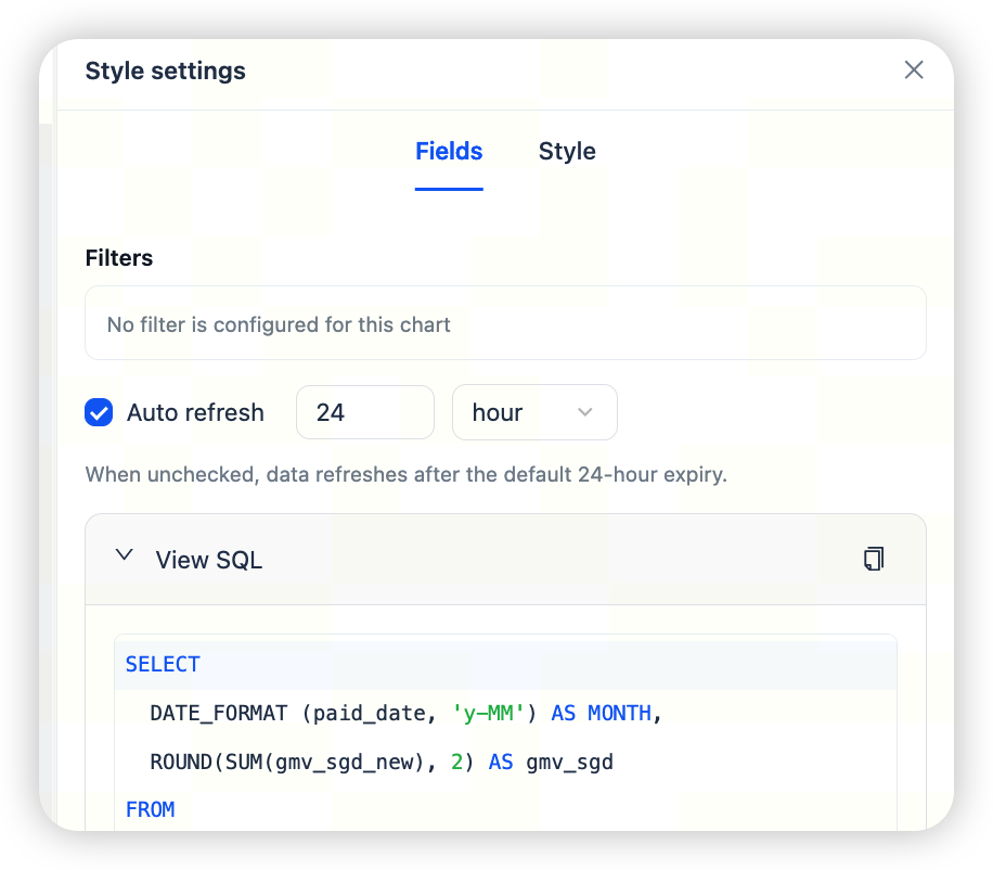
The Fields tab in component settings shows the metrics, filters, and refresh settings used by the current component. It also supports viewing the SQL.
If a chart's data looks incorrect, or you need to confirm whether global filter conditions have been applied, check this tab first. Style changes do not alter metric definitions. To change a metric definition, return to the metric configuration or analytics domain.
Usage recommendations
- Set page-level styles before component-level styles. If you do it in the opposite order, component changes may prevent later global style adjustments from taking effect, leading to repeated work.
- Use component settings only when a component genuinely needs to differ from the others.
- Before sharing a dashboard with business users, use page settings to align fonts, colors, and card styles across the dashboard.
- Style changes do not alter metric definitions. Handle definition changes in the metric configuration or analytics domain.
Version history
The dashboard details page provides a Version history entry. You can view previous versions and edit a dashboard based on a historical version. For versioning workflows, see Dashboard Version Management.
Expert mode
On the dashboard details page, select Edit dashboard, then open the more menu in the upper-right corner and select Expert mode.
This opens the Configure Dashboard dialog. Expert mode is intended for BI analysts who are familiar with the configuration structure. Business users should not edit these settings directly.
Dashboard design recommendations
A single dashboard should not try to answer every business question. We recommend the following principles:
- Build each dashboard around one stable business theme.
- Place the most important metrics above the fold.
- Limit the number of charts to avoid information overload.
- Group metrics that use the same definition or are closely related.
- Split different business themes into separate dashboards.
- Use consistent chart types for similar content to reduce the reader's learning cost.
When not to create a dashboard
Do not create a dashboard yet if any of the following conditions apply:
- Metric definitions have not been confirmed.
- Question-and-answer results are still unstable.
- Data sources are still being adjusted.
- The analysis has value only as a one-time exercise.
- Sensitive data is involved, but the required permissions have not been confirmed.
- Business users do not yet have a clear use case.
Frequently asked questions
Should I use ASK AI or manual editing?
Use ASK AI first when you need to add a chart or modify query logic, metric definitions, or filter conditions. Use manual editing first when you mainly need to adjust styles, layout, or the display details of an individual component.
Why did a page setting not affect a component?
The component may have an individual override. Once a setting is changed for a component, it uses its own configuration and no longer follows the corresponding page setting.