Building a Funnel Report to Decode Browsing-to-Purchase Drop-Off

A funnel report helps you track user behavior at every stage of their journey, from browsing to completing a purchase. It highlights where users leave the process, allowing you to pinpoint problem areas. For example, many ecommerce sites face significant drop-offs between adding items to carts and finishing purchases. Studies show that 27% of users abandon their carts before checkout, and 15% leave during payment entry. These numbers reveal how analyzing drop-offs can uncover opportunities to improve conversion rates and boost revenue.
Key Takeaways
A funnel report shows how users move from browsing to buying.
Important numbers like cart abandonment and purchase rates show problem spots.
Clear funnel steps help track user progress and find issues.
Testing small changes can boost sales and make users happier.
Automated funnel reports save time and track correctly, letting you improve.
Understanding Funnel Reports
What is a Funnel Report?
A funnel report is a tool that helps you visualize the steps users take on your website or app. It shows how many users move through each stage of their journey, from browsing to completing a purchase. By tracking these stages, you can identify where users drop off and stop progressing. This insight allows you to focus on improving specific areas of the user experience.
For example, if many users abandon their carts before checkout, the funnel report highlights this stage as a problem area. You can then investigate why users leave and make changes to reduce drop-offs. Funnel reports are essential for understanding user behavior and optimizing your website to increase conversions.
Key Metrics for Tracking Drop-Offs
Tracking the right metrics is crucial for understanding where users leave the funnel. Some key metrics include:
Cart Abandonment Rate: This measures the percentage of users who add items to their cart but do not complete the purchase. A high rate indicates friction in the checkout process.
Purchase Rate: This shows how effectively your site converts visitors into buyers. A low rate may signal issues with product relevance or pricing.
Search-to-Fill Rate: This evaluates how often searches lead to transactions. It reflects the quality and relevance of your product listings.
Metric | Description | Calculation Formula |
|---|---|---|
Purchase Rate | Measures the frequency at which visitors complete a purchase. | (Number of purchases / total visits) × 100% |
Search-to-Fill Rate | Indicates how often searches result in a transaction, reflecting the relevance of listings. | (Number of successful searches / Total searches) × 100% |
Cart Abandonment Rate | Percentage of shoppers who add products to their cart but do not complete the checkout process. | 1 - (Number of completed orders / Number of orders initiated) × 100 |
By analyzing these metrics, you can uncover patterns in user behavior. For instance, user behavior analysis can reveal how visitors interact with each step of the funnel. Engagement metrics, such as time spent on a page, can also help you identify friction points. These insights allow you to make targeted improvements, such as simplifying the checkout process or enhancing product descriptions.
Tip: Use A/B testing to experiment with changes in your funnel. This helps you determine which adjustments lead to higher conversion rates.
Steps to Build a Funnel Report
Setting Up Funnel Stages
To build an effective funnel report, you need to define clear stages that reflect the user journey. Each stage represents a critical step in the browsing-to-purchase process. For example, the stages might include awareness, interest, decision, and action. By segmenting the funnel into these stages, you can track user behavior and identify where drop-offs occur.
Here’s a step-by-step guide to setting up funnel stages:
Log into your GA4 account and navigate to the "Explore" tab.
Create a new exploration and select "Funnel Exploration."
Define your funnel steps based on events, such as page views, cart additions, and purchases.
Use AND/OR logic to refine step definitions and ensure accuracy.
Click "Apply" to view your funnel overview.
Industry benchmarks can help you evaluate the effectiveness of each stage. For instance, web visits typically convert to leads at a rate of 2–5%, while leads convert to marketing-qualified leads (MQLs) at 20–30%. Use these benchmarks to compare your funnel performance and identify areas for improvement.
Benchmark Conversion Rate | |
|---|---|
Web visits to Leads | 2–5% |
Leads to MQLs | 20–30% |
MQLs to SQLs | 25–30% |
SQLs to Opportunities | 30–40% |
Opportunities to Won | 20–30% |
Tip: Start with broad stages and refine them as you gather more data. This ensures your funnel captures the full user journey.
Defining Events and Goals
Events and goals are the backbone of your funnel report. Events track specific user actions, such as clicking a button or completing a form. Goals represent the desired outcomes, like making a purchase or signing up for a newsletter. Together, they provide a clear picture of user behavior and funnel performance.
Follow these steps to define events and goals:
Identify key actions users take on your site, such as adding items to a cart or initiating checkout.
Set measurable goals for each stage, like achieving a 10% conversion rate from cart additions to purchases.
Use GA4 to configure events and link them to your goals.
Success metrics help you evaluate whether your goals are driving improvements. For example:
Conversion Rate: Tracks the percentage of users completing a desired action.
Lead Generation: Measures the number of potential customers generated.
Customer Satisfaction: Indicates how well your site meets user expectations.
Metric | Description |
|---|---|
Conversion Rate | Percentage of users completing a desired action, indicating effective engagement. |
Lead Generation | Tracks the number of potential customers generated, essential for assessing marketing effectiveness. |
Customer Satisfaction | Indicates how well customer expectations are met, influencing retention and loyalty. |
Note: Use historical data to set realistic goals and adjust them as your funnel evolves.
Visualizing the Funnel
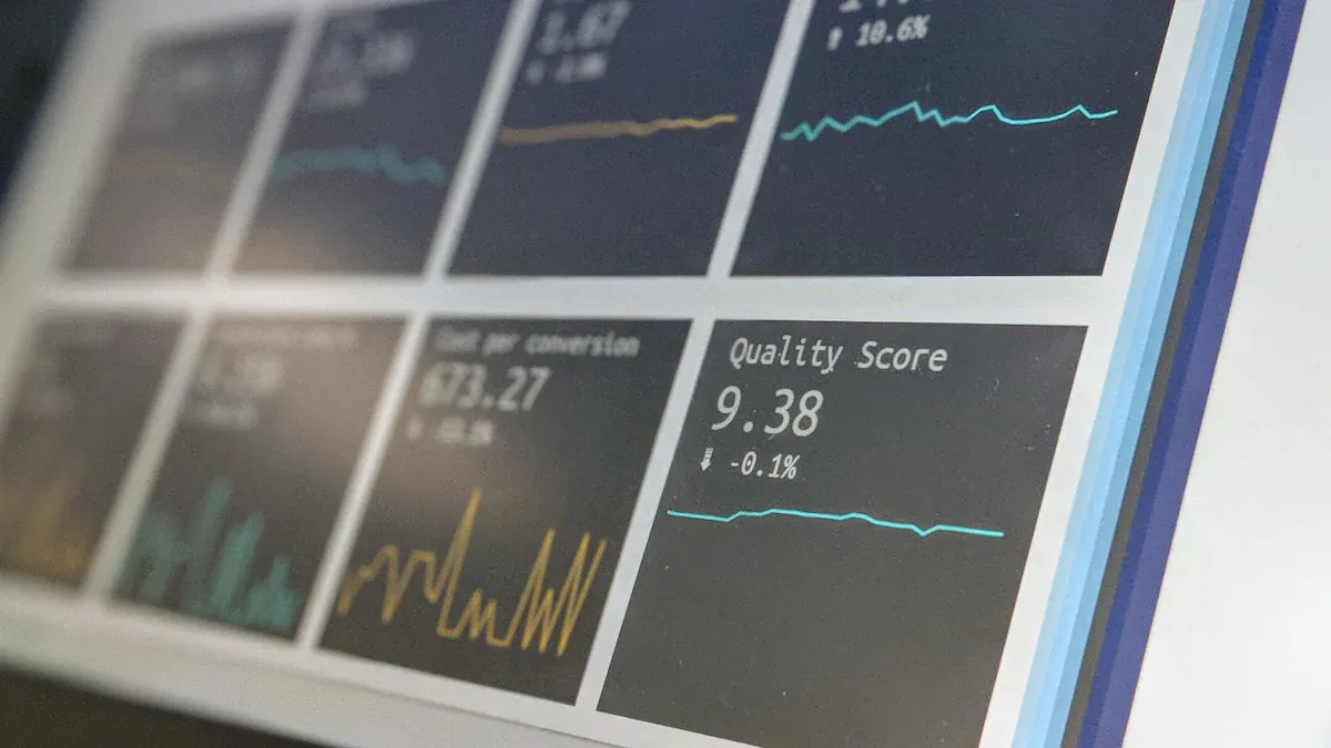
A well-designed funnel visualization makes it easier to interpret user behavior and pinpoint drop-off points. Funnel visualizations typically use charts or graphs to represent the flow of users through each stage. These visuals highlight conversion rates and leakage rates, helping you focus on areas that need improvement.
Consider these visualization models:
Traffic Sources Pie Chart: Displays the percentage of traffic from organic search, paid ads, and social media.
Stage-by-Stage Table: Breaks down visitors, conversion rates, and leakage rates for each funnel stage.
Stage | Visitors | Conversion Rate | Leakage Rate |
|---|---|---|---|
Awareness | 100,000 | 10% | 90% |
Interest | 10,000 | 20% | 80% |
Consideration | 2,000 | 25% | 75% |
To create a funnel visualization in GA4:
Log into your account and navigate to the "Explore" tab.
Select "Funnel Exploration" and define your funnel steps.
Use the summary pie chart to monitor user capture.
Tip: Use color-coded charts to make your funnel visualization more intuitive. This helps you quickly identify problem areas.
Analyzing Drop-Off Points

Identifying Drop-Off Trends
Understanding where users leave your funnel is crucial for improving conversions. By identifying drop-off trends, you can uncover patterns that reveal why users abandon their journey. Start by analyzing visitor behavior at each stage of the funnel. For example, monitor fluctuations in conversion rates to detect underperforming areas. If you notice a sudden drop in the "Add to Cart" stage, this could indicate issues like unclear pricing or unexpected shipping costs.
To make this process more effective, use tools that provide detailed insights. Funnel visualization tools allow you to see user movement through each stage. Session replays can help you understand the context behind drop-offs by showing how users interact with your site. These methods give you a clearer picture of where users face friction.
Key Features | Description |
|---|---|
Pinpoint drop-offs and boost conversions | Identify where users are getting stuck in the funnel and optimize conversions. |
Funnel visualization | Instantly see user movement through the funnel and identify issues quickly. |
Session Replay | Understand user behavior by viewing session replays to gain context behind drop-offs. |
Tip: Evaluate trends across different devices. Mobile users may face unique challenges, such as slow-loading pages or difficult navigation, that desktop users do not encounter.
Traditional tools often fail to explain why visitors drop off. To address this, focus on gathering actionable data. For instance, set up custom dashboards to monitor key metrics like bounce rates and time spent on pages. This approach helps you identify friction points and prioritize improvements.
Leveraging Historical Data for Insights
Historical data provides a wealth of information for understanding drop-off patterns. By comparing past and current trends, you can identify recurring issues and measure the impact of changes. For example, if your funnel report shows a consistent drop-off during checkout, historical data might reveal that a complicated process has been a long-standing issue.
Consider this example: An e-commerce company noticed a high drop-off rate during checkout. By streamlining the process and introducing guest checkout options, they increased conversion rates by over 25% in three months. Similarly, a subscription service reduced churn rates by 15% after implementing loyalty programs and personalized emails.
Example | Analysis | Action | Result |
|---|---|---|---|
E-commerce Company | Complicated checkout process led to high drop-off rate | Streamlined checkout, introduced guest checkout, clear progress indicators | Conversion rates increased by over 25% in three months |
Subscription Service | Low engagement correlated with higher churn rates | Implemented loyalty programs, personalized emails, improved support | Churn rate decreased by 15%, increased Customer Lifetime Value (CLV) |
To make the most of historical data, use advanced analytical techniques. Monitor power user paths to replicate their successful navigation patterns. Analyze session recordings to continuously improve the user experience. Google Analytics 4 offers advanced tools for deeper insights, enabling you to visualize user journeys and identify strengths and weaknesses in your funnel.
Note: Historical data is not just about identifying problems. It also helps you measure the success of your optimizations, ensuring that your strategies deliver long-term results.
Optimizing the Funnel
A/B Testing Strategies
A/B testing is one of the most effective ways to optimize your funnel. It allows you to test small changes and measure their impact on conversion rates. For example, you can experiment with different headlines, button colors, or layouts to see which version performs better. This approach minimizes risk by focusing on controlled changes rather than overhauling your entire funnel.
Start by identifying where users drop off in your funnel. Use tools like heatmaps or session replays to pinpoint problem areas. Then, create a hypothesis about what might improve conversions. For instance, if users abandon their carts, you could test offering free shipping or simplifying the checkout process. Regular A/B testing helps you adapt to changing customer behaviors and ensures your funnel remains optimized over time.
Source | Evidence |
|---|---|
Effective A/B Testing Ideas for Optimization and Conversions | Companies that adopt a data-driven approach see an average 25% increase in conversions. |
6 Real Examples and Case Studies of A/B Testing | Intertop’s conversion rate increased by 54.68%, leading to an 11.46% growth in average revenue per user. |
Resolving Technical Issues
Technical issues can disrupt your funnel and lead to inaccurate data. Common problems include tracking errors, slow-loading pages, or broken links. Resolving these issues ensures your funnel report reflects accurate user behavior. For example, implementing server-side tracking can improve data accuracy by up to 98%.
You should regularly audit your website for technical glitches. Fixing broken links, optimizing page speed, and ensuring mobile responsiveness can significantly reduce drop-offs. Accurate tracking also helps you measure the success of your optimizations more effectively.
Improving User Experience
A seamless user experience encourages visitors to move through your funnel. Start by analyzing user behavior with tools like heatmaps and session replays. These tools reveal where users face friction, such as confusing navigation or cluttered layouts.
Focus on creating a clean design with intuitive navigation. Highlight important information, like pricing or shipping details, to reduce uncertainty. Streamlining your funnel not only improves efficiency but also lowers drop-off rates. For example, simplifying the checkout process can lead to higher conversion rates and happier customers.
Tip: Regularly update your website based on user feedback to ensure it meets evolving expectations.
Tools for Funnel Reporting
Automating Funnel Reports
Automation simplifies funnel reporting and saves you time. Instead of manually tracking user behavior, automated tools collect and analyze data for you. These tools identify drop-off points and generate actionable insights. For example, marketing automation platforms can increase productivity by 20%. They streamline repetitive tasks like data collection and visualization, allowing you to focus on improving your funnel.
Automation also boosts lead generation. Platforms that integrate with your funnel report can increase qualified leads by up to 451%. This happens because automation ensures accurate tracking and faster analysis. You can use tools like Google Analytics 4 or HubSpot to automate your funnel reporting. These platforms offer features like real-time data updates and customizable dashboards.
Automation Method | Efficiency Increase |
|---|---|
Marketing Automation | |
Qualified Leads Increase | 451% increase in qualified leads |
Tip: Choose tools that align with your business goals. Look for platforms that offer integrations with your existing systems to maximize efficiency.
Setting Up Alerts for Drop-Offs
Alerts help you respond quickly to drop-offs in your funnel. They notify you when conversion rates fall below a certain threshold or when users abandon specific stages. Setting up alerts ensures you stay informed about potential issues before they impact your revenue.
You can configure alerts using tools like Google Analytics 4. Start by defining key metrics, such as cart abandonment rates or checkout completion rates. Then, set thresholds for these metrics. For example, you might want an alert if the cart abandonment rate exceeds 50%.
Alerts also help you prioritize fixes. If you receive frequent notifications about drop-offs during checkout, you can focus on simplifying that stage. This proactive approach minimizes revenue loss and improves user experience.
Note: Use alerts to monitor trends across different devices. Mobile users often face unique challenges, such as slower page loads, which can lead to higher drop-off rates.
A funnel report is essential for understanding and reducing browsing-to-purchase drop-offs. For instance, a staggering 98.11% drop-off rate at the payment stage highlights the need for targeted optimizations. To improve your funnel, consider strategies like predictive analytics, combining data sources, and leveraging visualization tools. These methods reveal hidden patterns and provide actionable insights. Start building your funnel report today to uncover opportunities, optimize user journeys, and boost conversions. Automation tools can simplify this process, ensuring you stay ahead in a competitive market.
Strategy | Description |
|---|---|
Use predictive analytics | Connect to tools for predictive data modeling to gain forward-looking insights and compare predictions against history. |
Integrate disparate data points to visualize the complete customer journey without fragmentation. | |
Use data visualization tools | Transform raw data into visual patterns to reveal relationships that are not apparent in numbers alone. |
Tip: Begin with small improvements and measure their impact to build momentum toward long-term success.
FAQ
What is the main purpose of a funnel report?
A funnel report helps you track user behavior across different stages of their journey. It identifies where users drop off, allowing you to focus on improving those areas to boost conversions.
How do you choose the right metrics for your funnel report?
Focus on metrics that reflect user engagement and conversion. Examples include cart abandonment rate, purchase rate, and search-to-fill rate. These metrics highlight friction points and help you prioritize optimizations.
Can you automate funnel reporting?
Yes, tools like Google Analytics 4 and HubSpot allow you to automate data collection and visualization. Automation saves time and ensures accurate tracking, enabling you to focus on improving your funnel.
How often should you analyze drop-off points?
You should analyze drop-off points regularly, ideally weekly or monthly. Frequent analysis helps you identify trends and respond quickly to issues that impact your conversion rates.
What tools are best for visualizing funnel data?
Google Analytics 4 and specialized visualization tools like Tableau are excellent options. They provide clear charts and graphs that make it easier to interpret user behavior and pinpoint drop-offs.
See Also
Effective Strategies for Retail Demand Forecasting Each Week
User Behavior Insights Using SQL and BI Without Complexity
Why Need-Based Recommendations Outperform Standard Purchase Lists
Exploring Short-Term Demand Forecasting Techniques and Challenges
Understanding Route Optimization Algorithms for Speedy Deliveries